Design, branding, and accessibility
Sermon YouTube thumbnails: the right size and 7 design rules for readable thumbnails
The official YouTube thumbnail size for sermons and Shorts, checked on 15 October 2026, plus seven plain design rules for a readable, honest sermon thumbnail.
A sermon thumbnail for a normal YouTube video should be 3840 x 2160 pixels at a 16:9 ratio, saved as a JPG or PNG. That is what YouTube Help recommends. It gives a minimum width of 640 pixels, and the file must stay under 2 MB if you upload from a phone or 50 MB on a computer.
Size gets you a clean upload. It does not make the thumbnail readable. A thumbnail works when someone can read it on a small phone screen in about a second. This guide gives the official numbers first, then seven design rules a volunteer can follow without design training.
Last checked 15 October 2026.
What size should a sermon YouTube thumbnail be?
Here is what YouTube's custom thumbnail page says, accessed 15 October 2026. It says a thumbnail should:
- "Have a resolution of 3840 x 2160 pixels for videos and 2160 x 3840 for Shorts"
- have "a minimum width of 640 pixels for videos and a minimum height of 640 pixels for Shorts"
- be uploaded in "image formats such as JPG or PNG"
- be under "2 MB for video thumbnails or 10 MB for podcasts" on mobile, and "50MB for video, Shorts, and podcast thumbnails" on desktop
For ratio, the page says to try 16:9 for videos, 9:16 for Shorts, and 1:1 for podcast playlists.
You may have seen 1280 x 720 elsewhere. Many guides still give 1280 x 720. The page above does not mention 1280 x 720 today. It is still a 16:9 size, so a 1280 x 720 file works as a thumbnail, but the size YouTube names now is 3840 x 2160. If you design at 3840 x 2160 and export at that size, you meet the current recommendation. If your tool tops out lower, keep the 16:9 ratio and stay above the 640 pixel minimum width.
| What you upload | Recommended size | Ratio | Notes |
|---|---|---|---|
| Full sermon video | 3840 x 2160 px | 16:9 | Minimum width 640 px. JPG or PNG. |
| Short (vertical clip) | 2160 x 3840 px | 9:16 | Minimum height 640 px. |
| File size, mobile upload | Under 2 MB (video thumbnails) | From the same page. | |
| File size, desktop upload | Under 50 MB | Video, Shorts and podcast thumbnails. |
Do sermon Shorts get their own thumbnail?
Yes, but with a catch. YouTube's page says custom thumbnails for Shorts can currently only be added in YouTube Studio on a computer. It lists 2160 x 3840 pixels and a 9:16 ratio for Shorts.
On length, YouTube's Shorts help page says: "You can now create YouTube Shorts up to three minutes in length." For standard channels, that applies to uploads from 15 October 2024. A video must be square or vertical to count as a Short. So a three-minute vertical clip from a sermon can be a Short. A longer or horizontal video cannot.
A Short is a vertical clip. If you want to cut your sermon into vertical clips, Sermon Uploads by Church Media Kit makes short vertical clips with captions from an uploaded sermon recording, ready to post as YouTube Shorts, Instagram Reels and TikToks. You download them and post them yourself.
The 7 design rules
YouTube's own thumbnail and title guidance says thumbnails "show up differently across devices," so the image should be as large as possible. It asks for an easy-to-read font and says not to make the design too complex. The seven rules below turn that into a checklist.
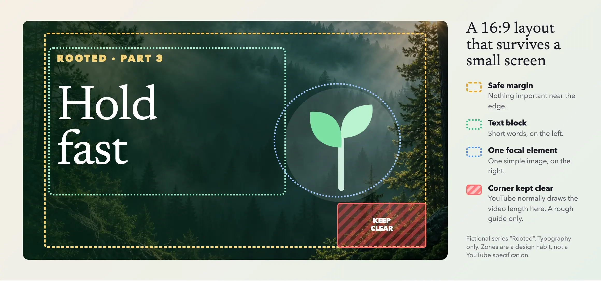
Figure 1. A layout sketch for a fictional series called "Rooted". Typography only, no people. The margin and corner zones are a design habit, not a YouTube specification.
In words: keep a margin around the edges, put a short text block on the left, give the right side one simple image, and leave the bottom-right corner clear. YouTube normally draws the video length over that corner. YouTube Help does not publish the size of that badge, so treat the zone as a rough guide.
1. Make it readable at phone size
On a phone, a thumbnail can be very small. Shrink your design to about 120 pixels wide and look at it. If you cannot read it, enlarge the type or cut words.
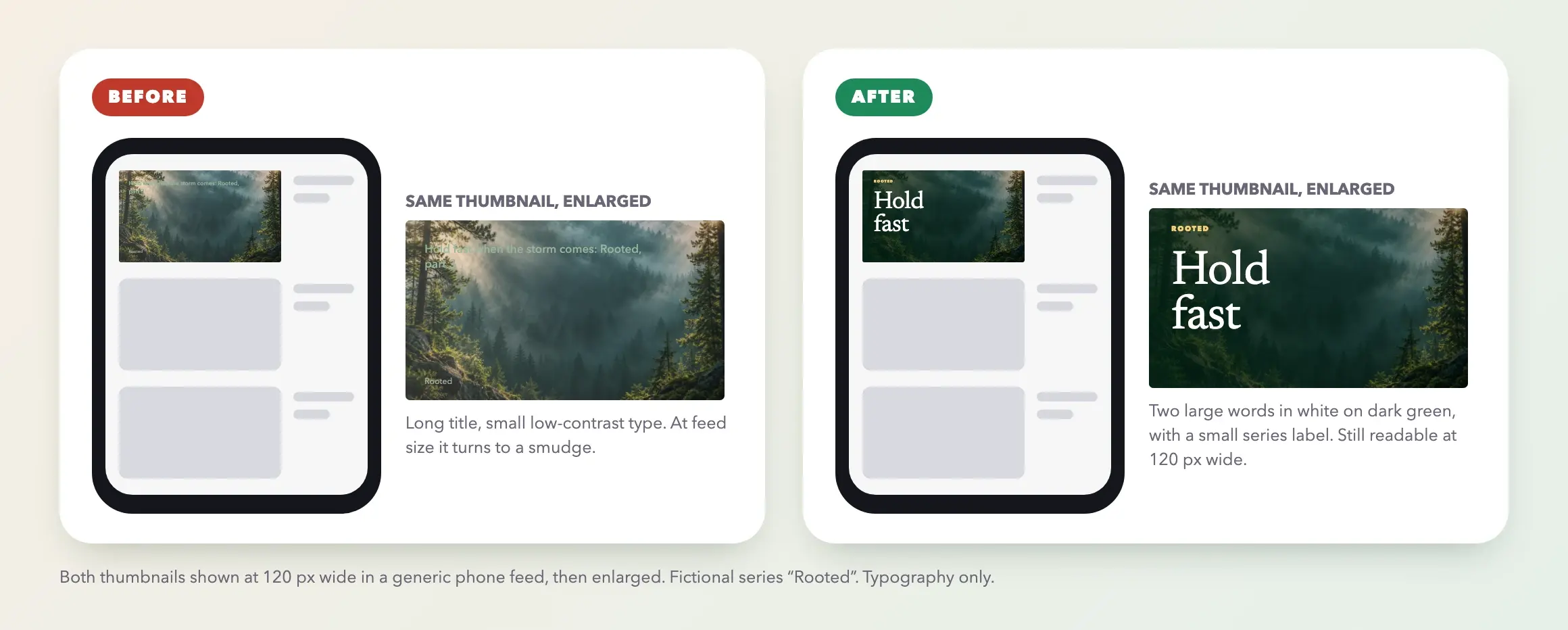
Figure 2. Before and after at 120 px wide. Before: a long title in small, low-contrast type. After: two large words in white on dark green, with a small series label. Fictional series "Rooted".
See how your thumbnail reads at phone size:
Thumbnail phone preview
See how a thumbnail looks at the size a phone feed shows it.

Rooted · Part 3
Hold fast
Verdict at phone size
Readable at phone size
Strong contrast and a title big enough for a 120 px wide thumbnail.
Contrast (estimate)
11.0:1
Word count
2 words
A little short. 3 to 5 words usually works best. Estimated contrast between your text colour and the average brightness of the background behind the title. At 120 px wide the title is about 13 px tall.
Finding Peace in a Loud Week
Sample church · 2 days ago
Rooted · Part 3
Hold fast
Hold fast
Your church · 2 days ago
The Table Is Ready | Easter Sunday
Sample church · 5 days ago
The Table Is Ready | Easter Sunday
Sample church · 5 days ago
Rooted · Part 3
Hold fast
Hold fast
Your church · 2 days ago
Wait Well: Advent Week 1
Sample church · 1 week ago
A rule of thumb. Contrast uses the WCAG formula, with 4.5:1 as the target and 3:1 as the floor, and is estimated from one average over the area behind the title, so a busy background can read worse than the number. Titles under about 9 px tall at 120 px wide are flagged. Channel names, videos and the feed are fictional.
Want this tool on its own page? Open the free thumbnail phone preview. For the wider picture, see our guide to sermon series graphics.
2. Use three to five words at most
The sermon title is long. The thumbnail does not need all of it. Pull out the two or three words that carry the idea, such as "Hold fast" from a longer title. The full title goes in the YouTube title field.
3. Use one face or one image
A crowded collage reads as noise at small size. Choose one clear subject: the speaker, a single photograph, or a simple graphic. If you use a person, use a photo you have permission to publish, and check that children are not identifiable unless their families have agreed.
4. Make the contrast obvious
White or very light type on a dark area, or dark type on a light area. Avoid text over a busy part of a photo. W3C's WCAG 2.2 asks for a 4.5:1 contrast ratio for ordinary text and 3:1 for large text. A thumbnail is not a web page, but those numbers are a sensible floor for type you want people to read. Our accessible graphics review shows how to measure it.
5. Use one template per series
If you preach a series, reuse the same layout, colors and type each week and change only the key words and image. Viewers learn to spot the series in a list. Our guide to consistent church graphics explains how to keep a family resemblance without every thumbnail looking identical.
6. Avoid clickbait
YouTube's guidance says the title should accurately represent the video.
7. Let the title and the thumbnail share the work
Do not repeat the same words in both. If the thumbnail says "Hold fast," the title can say "Hold fast when the storm comes: Rooted, part 3". The thumbnail gives the hook. The title gives the context. YouTube's page says titles should be short with the most important words first, because viewers may see only part of them.
What about alt text and descriptions?
We could not find an alt text field for thumbnails on the YouTube Help page above. So make sure the message does not live only in the image. Put the sermon's topic, the Scripture passage and the speaker's name in the title and description. Turn captions on for the video itself.
If your church posts the same thumbnail elsewhere, such as in a website post or social post, add alt text there, following the steps in our accessible graphics guide.
A simple routine for each week
- Pick the two or three words that carry the sermon's idea.
- Open your series template and replace the words and the image.
- Export the largest JPG or PNG your Design download offers, keep it at least 640 px wide and under the file size limit. A large PNG can exceed the 2 MB mobile upload limit, so export JPG if needed.
- Shrink it to about 120 pixels wide and check you can read it.
- Upload it in YouTube Studio and look at the preview on a phone.
Write the title and description before you finish the thumbnail, so the two fit together.
Where Church Media Kit fits
There is no YouTube preset, but Design's Church Screens templates are 16:9 at 1920 x 1080. That is above YouTube's minimum width, The download panel shows each file's exact pixel size.
Where it can help is the words around the thumbnail. Sermon Uploads by Church Media Kit generates a sermon title and a summary from an uploaded recording, which you can edit and use as a starting point for your YouTube title and description. It also makes vertical clips for Shorts. Read the draft before you use it.
Start with one sermon
Prepare clips and post text for your church to review.
with a free account and see what Sermon Uploads produces from one recording. No card is needed.
Quick answers
What is the best size for a sermon YouTube thumbnail? 3840 x 2160 pixels, 16:9, JPG or PNG, per YouTube Help as of 15 October 2026.
Is 1280 x 720 still right? It is still 16:9 and above the minimum width, but YouTube's page no longer names it.
How long can a Short be? Up to three minutes for uploads since 15 October 2024.
How many words should a thumbnail have? Three to five at most. Fewer is usually better.