Sermon series graphics that look like one series.
Sermon series graphics that look like one series on a post, a slide, a thumbnail and a story, with tools to pick fonts and check a thumbnail on a phone.
Free account, no card needed. Plans from US$29.95/month
What are sermon series graphics?
Sermon series graphics are the set of images that carry one series name across the screen, social media and YouTube. A series looks like a series when one title treatment, two fonts and a short color list repeat in every size.
- Most series need four formats: a 1080 × 1080 Square post, a 1920 × 1080 slide, a 3840 × 2160 thumbnail (16:9, minimum 640 px wide) and a 1080 × 1920 Story.
- Reuse the series title, the same two fonts and one or two colors in every format. That is our own rule of thumb, not a standard.
- Sermon to Social drafts a week of social graphics from a public YouTube sermon, and Design edits them with your Brand Kit.
- Design is free with any account, with no card needed.
One series, five slides.
Five slides from a fictional sermon series, The Open Door, drawn for this guide. The sky, the gold and the type stay the same on every slide.

The Open Door
Week 2 · Luke 11:5–13
Series title slideThe series name and the passage. It is the slide on the screen as people arrive. Keep asking, and it will be given you. Keep seeking, and you will find. Keep knocking, and it will be opened to you.
Luke 11:9 (WEB)
Scripture slideThe same sky behind the verse, so the series reads as one set. Week 2
Keep asking, because you are talking to a Father.
Point slideOne idea in the series voice, with the week’s line in gold. The verb Jesus chooses is a continuing one.
Quote slideThe line people will repeat on the way out, set large in the same type. Luke 11:5–13
The Open Door · Week 2
Livestream lower thirdThe series line in a strip on the stream, so online viewers see the same look.
Try the look before you commit.
Pick the two fonts for your series, then see the thumbnail at the size a phone feed shows it.
Font pairing previewer
Compare headline and body font pairings on a sample church post.
Social post
Sermon slides
Print flyer or bulletin
Scripture text
Series title art

Your church name
Walk in the light
Join us this Sunday at 10:00 for worship, coffee and a message for the whole family.
Sunday 10:00
Sample post, slide and flyer for a fictional church
Pairing 1: Poppins Bold with Inter
Why it works: Poppins is round and friendly, with generous shapes that hold up when a phone shrinks the image. Inter is built for screens and stays clear at small sizes.
Where to avoid it: Avoid it when your brand is traditional or liturgical, where the geometric shapes may feel too casual.
SIL Open Font License — free for church use
Thumbnail phone preview
See how a thumbnail looks at the size a phone feed shows it.
Rooted · Part 3
Hold fast
Verdict at phone size
Readable at phone size
Strong contrast and a title big enough for a 120 px wide thumbnail.
Contrast (estimate)
11.0:1
Word count
2 words
A little short. 3 to 5 words usually works best. Estimated contrast between your text colour and the average brightness of the background behind the title. At 120 px wide the title is about 13 px tall.
Finding Peace in a Loud Week
Sample church · 2 days ago
Rooted · Part 3
Hold fast
Hold fast
Your church · 2 days ago
The Table Is Ready | Easter Sunday
Sample church · 5 days ago
The Table Is Ready | Easter Sunday
Sample church · 5 days ago
Rooted · Part 3
Hold fast
Hold fast
Your church · 2 days ago
Wait Well: Advent Week 1
Sample church · 1 week ago
A rule of thumb. Contrast uses the WCAG formula, with 4.5:1 as the target and 3:1 as the floor, and is estimated from one average over the area behind the title, so a busy background can read worse than the number. Titles under about 9 px tall at 120 px wide are flagged. Channel names, videos and the feed are fictional.
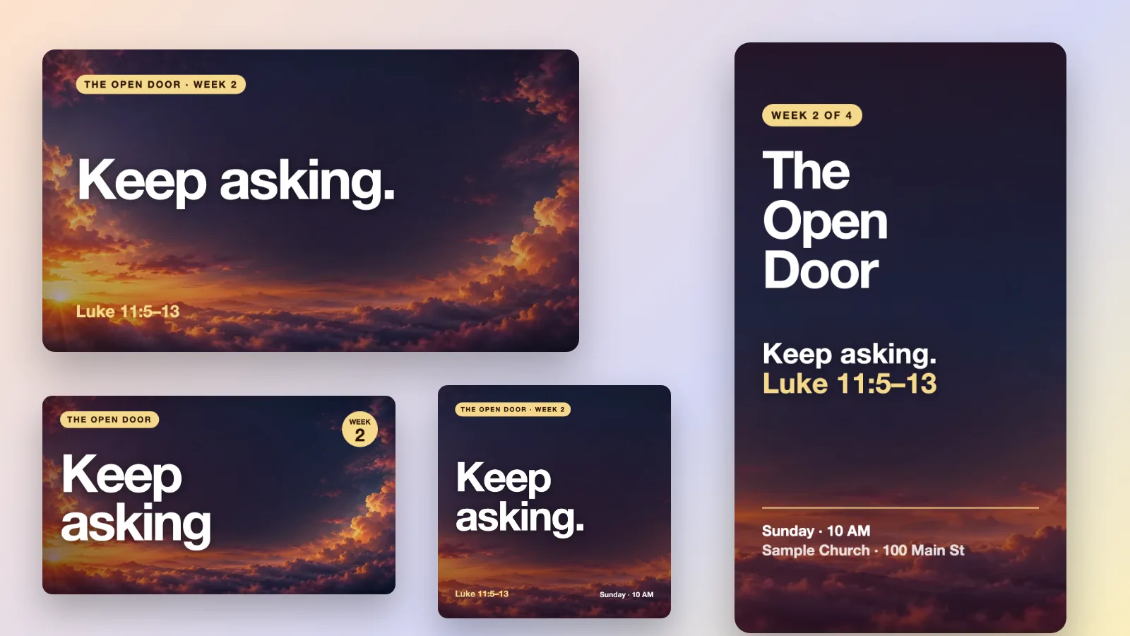
The same series in every format.
Choose a format to see the series in it, drawn to scale. Every one carries the same title, gold label and type.
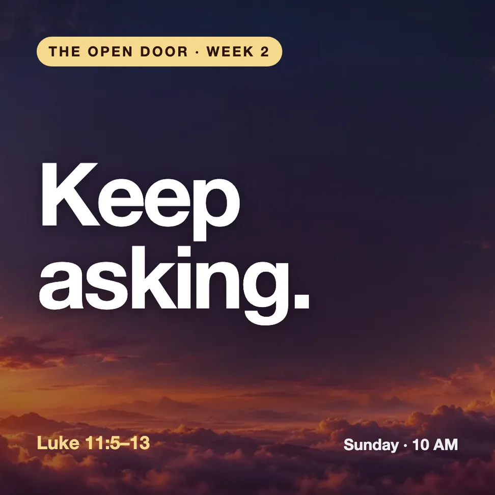
Feed post: Square post
1080 × 1080
Put the series name or the week’s line first. Square works in any feed, and Design can copy a finished post into Portrait or Story.
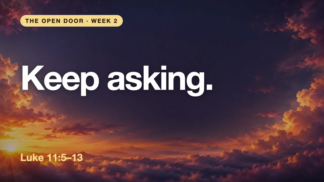
Room screen: Slide
1920 × 1080
Church Screens designs in Design are 16:9 at 1920 × 1080. Keep text inside a margin of about 5% on every edge.
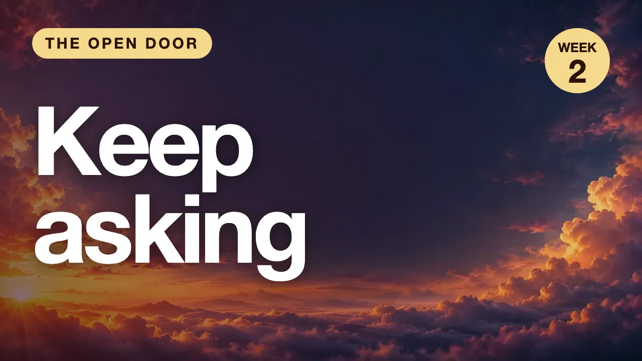
YouTube: Thumbnail
3840 × 2160
YouTube Help names 3840 × 2160 (16:9, minimum 640 px wide) for a thumbnail; a 1280 × 720 file is still 16:9 and works. Keep to a few big words that still read at phone size, and use the preview tool above to check.
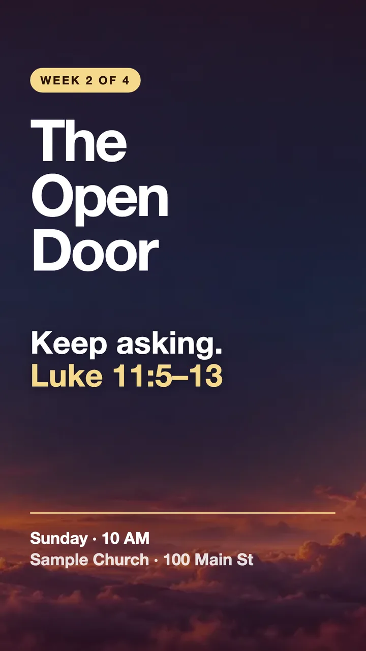
Story
1080 × 1920
Story is the invite: series name, week, passage and the time to come. Leave space at the top and bottom for the app’s own buttons.
One fictional sermon series in four formats: a Square post, a 16:9 slide, a 16:9 thumbnail and a Story.
How to give a series its own look.
Set the title treatment once
Decide how the series name looks: its words, case, size and where it sits. Use it unchanged on the post, slide, thumbnail and Story.
Pick two fonts and one or two colors
One font for the big words and one for the small. One color for the label or reference that repeats. Put them in your Brand Kit so every design starts with them.
Change only the week’s line
Each week swaps the line, the passage and the number. The sky, the label and the type stay put, so the series reads as one thing.
Make the set from your sermon.
Sermon to Social drafts a week of social graphics from a public YouTube sermon, and Design is where you edit them with your church’s logo, colors and fonts, then download. Design is free with any account.
Frequently asked questions
One series, one look.
Set the look once, then make each week’s post, slide, thumbnail and Story from it.
Free account, no card needed. Plans from US$29.95/month
Also in Church Media Kit
Included in your subscription.
 Sermon to SocialTurn a public YouTube sermon into editable Facebook and Instagram posts you review and share yourself.
 Sermon UploadsUpload a sermon and get vertical clips, plus a transcript and social posts.
 Sermon SlidesSlides and livestream lower thirds, made from the sermon you paste.
 DesignEdit any design in your browser, with your church's look.
 Verse of the DayA new verse design to share, every day.
 Church in bioOne church page to link from your Instagram and Facebook bio.