Design, branding, and accessibility
Best fonts for church graphics: 12 free pairings that stay readable
Twelve free Google Fonts pairings for church social posts, sermon slides, bulletins, scripture and series art, with readability rules and what to avoid.
The best fonts for church graphics are plain, sturdy sans-serif faces for anything seen on a screen, a readable serif for long printed text, and one expressive font reserved for titles. Every pairing below is free for commercial use under the SIL Open Font License, and you only need two of them for your whole church.
A font is "free" in two different ways. It costs nothing, and it may be used in work you share without paying a fee. The second part is the one that matters for a church that prints bulletins or posts graphics. All 23 fonts in this guide are listed on Google Fonts under the SIL Open Font License (OFL). Licence and listing last checked 15 October 2026.
Which fonts are safe for a church to use?
Fonts from Google Fonts are the simplest safe choice. The Google Fonts repository README says each family folder carries its own licence file, that most fonts use the SIL Open Font License v1.1, and that some use Apache 2. It also tells users to read the licence for every font they use.
For every font in this guide we checked the family's metadata in that repository and found the OFL listed (checked 15 October 2026). The OFL FAQ explains the terms in plain language. The short version for a church: you may use the fonts in graphics, slides and printed pieces, and you may not sell the font files on their own.
Two cautions. First, "free download" sites often bundle fonts with personal-use-only terms. Get fonts from the library that publishes the licence. Second, the licence covers the font, not the text you set in it. Song lyrics and Bible translations have their own permissions.
If you set these fonts in another design tool, also check that tool's own terms. We did not verify the font terms of other tools for this guide.
Which font pairs work for which job?
Pair by job, not by taste. A social post, a projected slide and a printed bulletin are read at different distances, in different light, on different surfaces. The table lists all 12 pairings with the heading font first. Sample wording is invented for illustration, except the Psalm 46:10 verse, quoted from the King James Version.
| # | Job | Heading font | Body font |
|---|---|---|---|
| 1 | Social post | Poppins Bold | Inter |
| 2 | Social post | Fraunces SemiBold | Hanken Grotesk |
| 3 | Social post | Plus Jakarta Sans ExtraBold | Lora |
| 4 | Sermon slides | Montserrat ExtraBold | Source Sans 3 |
| 5 | Sermon slides | Archivo ExtraBold | Noto Sans |
| 6 | Sermon slides | Work Sans Bold | Source Serif 4 |
| 7 | Print flyer or bulletin | Playfair Display Bold | Lato |
| 8 | Print flyer or bulletin | Libre Baskerville Bold | Libre Franklin |
| 9 | Scripture text | EB Garamond Medium | Hanken Grotesk SemiBold (reference line) |
| 10 | Series title art | Cinzel SemiBold | Nunito Sans |
| 11 | Series title art | DM Serif Display | DM Sans |
| 12 | Series title art | Bebas Neue | Open Sans |
Compare these pairings on a sample post:
Font pairing previewer
Compare headline and body font pairings on a sample church post.
Social post
Sermon slides
Print flyer or bulletin
Scripture text
Series title art

Your church name
Walk in the light
Join us this Sunday at 10:00 for worship, coffee and a message for the whole family.
Sunday 10:00
Sample post, slide and flyer for a fictional church
Pairing 1: Poppins Bold with Inter
Why it works: Poppins is round and friendly, with generous shapes that hold up when a phone shrinks the image. Inter is built for screens and stays clear at small sizes.
Where to avoid it: Avoid it when your brand is traditional or liturgical, where the geometric shapes may feel too casual.
SIL Open Font License — free for church use
Want this tool on its own page? Open the free font pairing previewer. For the wider picture, see our guide to church graphics.
What are the best fonts for church social posts?
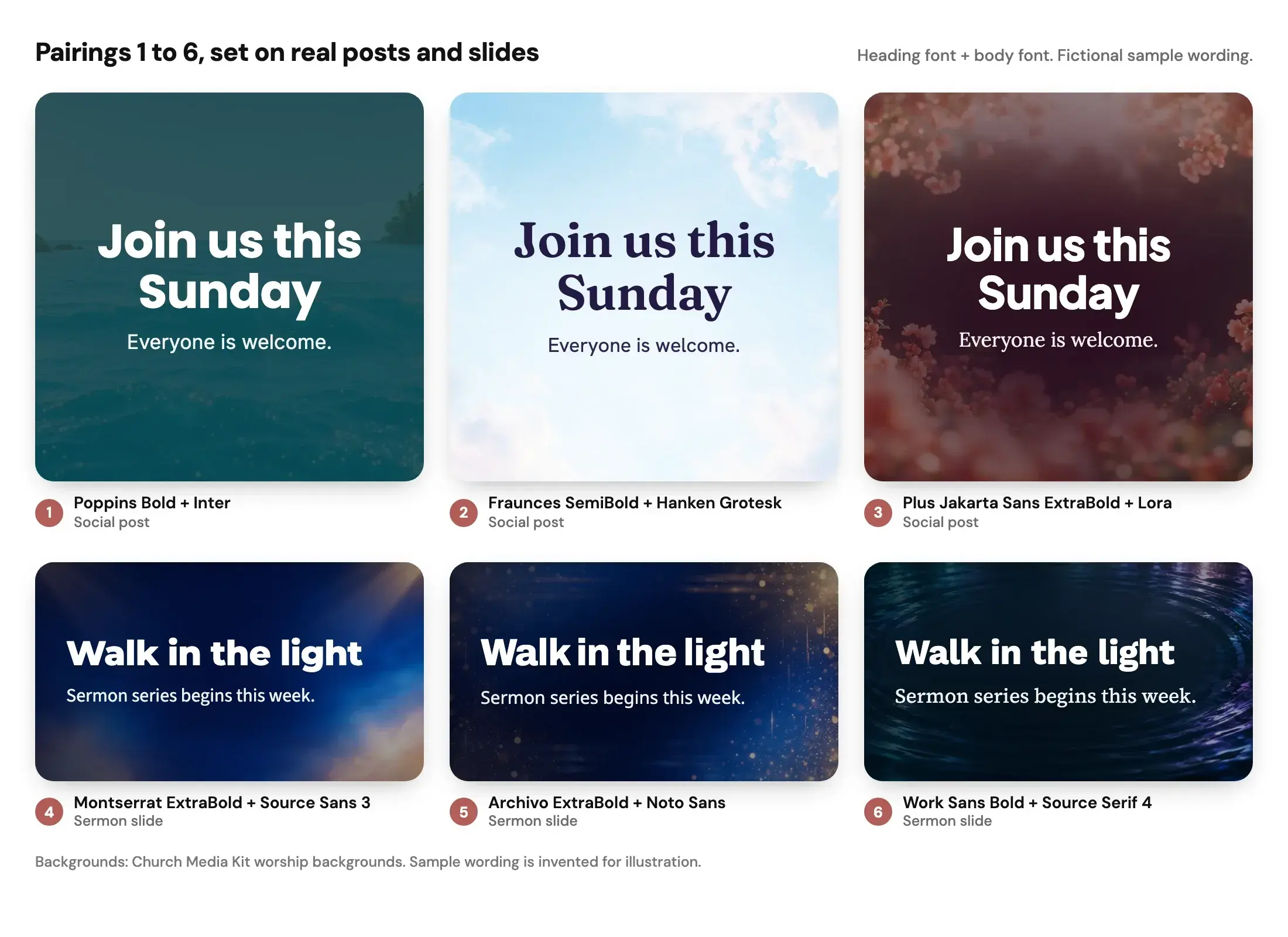
Social posts are small, fast and read at arm's length. Choose a clear heading and a calm body. Pairings 1 to 3 do that.
1. Poppins Bold with Inter. Poppins is round and friendly, with generous shapes that hold up when a phone shrinks the image. Inter is built for screens and stays clear at small sizes. Avoid it when your brand is traditional or liturgical, where the geometric shapes may feel too casual.
2. Fraunces SemiBold with Hanken Grotesk. Fraunces adds warmth with a soft serif heading, and Hanken Grotesk keeps the supporting text quiet. It suits a gentle, welcoming voice. Avoid very thin weights of Fraunces at small sizes, where the fine strokes fade.
3. Plus Jakarta Sans ExtraBold with Lora. A heavy sans heading and a book-style serif body. It reads as modern but not cold. Avoid setting the Lora body below a comfortable size on a busy photograph, because serif details blur against texture.
For post-level layout checks, see our guide to accessible church social graphics.
What are the best fonts for sermon slides?
Slides are read from far away, often from a dim room, and the back row decides whether the font works. Look for heavy weights, wide letters and a tall x-height (the height of lowercase letters such as "x" and "e"). Pairings 4 to 6 meet those needs.
4. Montserrat ExtraBold with Source Sans 3. Montserrat is wide and sturdy, which makes headings legible on a projector. Source Sans 3 supports it with a clear, neutral body. Avoid all-caps Montserrat for long phrases, because wide capitals eat space quickly.
5. Archivo ExtraBold with Noto Sans. Archivo is compact and strong, and Noto Sans belongs to Google's Noto project, which aims to cover many writing systems, so it may help a multilingual congregation. Avoid mixing in Archivo's lighter weights on slides, where they thin out.
6. Work Sans Bold with Source Serif 4. A friendly sans heading with a serif for verses and quotations. Avoid using the serif for slide bullets in a large room, because lighter serif strokes can disappear in projector glare.
How big should text be? The Presentation Guild's 8H rule says minimum text height is the distance to the back row divided by 400. A back row 20 metres (about 787 inches) away gives roughly 2 inches, or 5 cm, of text height on the screen. The author calls this a legibility minimum, not a comfortable size. Essential text should be well above it, and a slide with most text at the minimum has too many words. We are applying a general presentation rule, not church-specific research, so check from your own back row.
What fonts work for print flyers and bulletins?
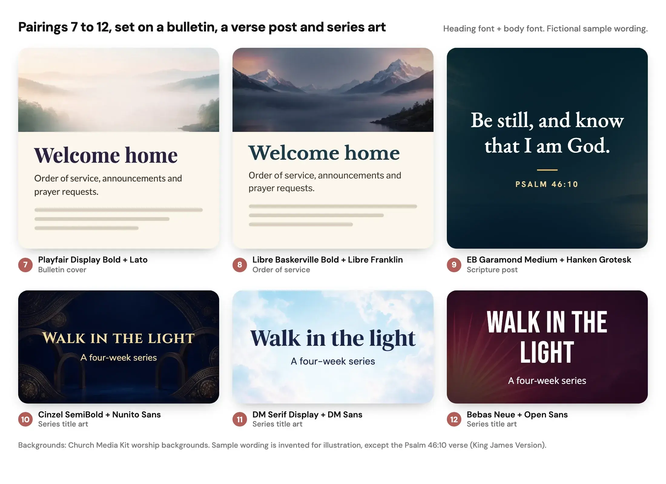
Print gives you sharper detail than a phone, so a classic serif is a safe choice for paragraphs. Keep headings simple and let white space do the work. Pairings 7 and 8 are for paper.
7. Playfair Display Bold with Lato. Playfair has high contrast between thick and thin strokes, which looks elegant at heading size. Lato is a clear, humanist body. Avoid Playfair for small text, where the thin strokes break up in print.
8. Libre Baskerville Bold with Libre Franklin. A traditional serif heading with a clean sans body, suited to an order of service. Avoid it on dark backgrounds with small text, where serif hairlines vanish.
Our minimum church brand guide covers writing down a font choice so that volunteers use the same one each week.
What fonts suit scripture text?
Scripture graphics hold a sentence or two, so the font should feel steady and respectful and keep the reference easy to find.
9. EB Garamond Medium with Hanken Grotesk SemiBold. EB Garamond gives verses a classic, bookish look. Setting the reference (for example, "PSALM 46:10") in a small, bold sans separates it from the verse. The King James Version is public domain in the United States; for any other translation, check its publisher's permissions before you put it on a graphic. Avoid light weights of Garamond-style faces on photographs, since fine strokes and a small x-height make them harder to read than their elegance suggests.
What fonts work for sermon series titles?
A series title is the one place for personality, and it can be large because it is only a few words. Use one expressive font for titles and a plain one for the line beneath.
10. Cinzel SemiBold with Nunito Sans. Cinzel's classical capitals feel formal and ancient. It is designed for capitals, so keep titles short. Avoid it for long titles or any line a reader must absorb quickly.
11. DM Serif Display with DM Sans. Both fonts come from the same designers and sit together easily. The serif gives a warm headline and the sans carries details. Avoid DM Serif Display below headline size, because it is made for display use.
12. Bebas Neue with Open Sans. A tall, condensed, all-caps title face that fills a banner well. Avoid it for more than a few words, because condensed capitals tire the eye.
What readability rules apply to any church font?
Four checks catch most problems.
- Contrast first. WCAG 2.2 success criterion 1.4.3 asks for at least 4.5:1 contrast for normal text and 3:1 for large text, which it defines as at least 18 point, or 14 point bold. Check colours with a contrast tool rather than by eye.
- Weight over elegance. A heavier weight survives compression, glare and distance. Treat the thinnest weights of any family as decoration only.
- Size by testing. There is no universal point size for a social graphic, as our accessibility guide explains. As an editorial starting test, not a standard: export the graphic, open it on a phone at arm's length, and simplify if you have to zoom to read the main message.
- Keep line length short. Break headlines into two or three short lines rather than shrinking the font to fit one long one.
Which fonts should a church avoid?
Avoid a font for a reason, not because it is out of fashion. These categories cause real readability problems.
- Script and handwriting faces for body text. Connected letters slow reading and fail at small sizes. Use them for a single word, if at all.
- Very thin or "light" weights. They fade on projectors and in compressed social images.
- Heavily decorative blackletter or gothic faces. They feel traditional but are slow to read and easy to misread.
- Too-similar pairings. Two fonts that almost match look like a mistake. Pair fonts that clearly differ, such as a serif with a sans.
- Fonts that lack the characters you need. If your congregation reads accented or non-Latin text, test a sample before you commit. Noto Sans, for example, belongs to Google's Noto project, which aims to cover many writing systems.
- Fonts from unknown download sites. Licence terms may exclude commercial use, which includes printed flyers.
How can a church keep its brand to two fonts?
Two fonts are enough: one for headings and one for everything else. Choose a pairing for your main need, write down exact names and weights, and stop there. A brand that uses one family for titles and another for text looks the same across posts, slides and print without anyone policing it.
If you also need series art, add an expressive title font only to series graphics and call it an exception. Most weekly work then stays in your two main fonts.
Our guide to keeping graphics consistent without making every post identical shows how to vary layout and colour while the fonts stay fixed.
Which of these fonts are in Design by Church Media Kit?
All 23 fonts in this guide are in the Design font catalogue, and a Brand Kit can store a heading font and a body font from that catalogue. The catalogue holds well over 100 Google Fonts, so the choice is wide, but the same advice applies: pick two and stay with them.
You still download the finished design and post it yourself. See what you can edit in Studio for the editing tools.
Start with one sermon
Prepare clips and post text for your church to review.
A free account needs no card, and Design is free with any account.
Frequently asked questions
Are Canva fonts free for churches?
Canva has its own font library and licensing terms, and we did not verify them for this guide. Check Canva's current terms before printing or selling anything. The Google Fonts in this guide are free under the OFL, whichever tool you use to set them.
Can I use Google Fonts on a printed church bulletin?
Yes. The OFL allows commercial use of the fonts in documents and printed material, and you may not sell the font files by themselves. Keep the licence file if you share the fonts with a volunteer.
What font looks religious?
No font is inherently religious. Classical serifs and capitals such as Cinzel feel traditional. Clear sans-serifs feel contemporary. Choose for readability and tone, then match your congregation's expectations.