Design, branding, and accessibility
Church flyer ideas: what to put on a church flyer (with examples and sizes)
The six things every church flyer needs, welcoming copy for seven event types, a type-only layout that needs no photos, and print and social sizes with bleed, QR code and contrast basics.
A good church flyer answers six questions in a few seconds: what it is, who it is for, when, where, what to do next, and how to reach someone. If a stranger can read those from across a room, the design has done its job. Everything else, including photos, is optional.
This guide gives you that checklist, welcoming copy you can adapt for seven kinds of event, a layout that needs no pictures, and the sizes and print basics that trip people up. It was last checked on 15 October 2026.
How do you design a church flyer?
Start with the words, not the template. Write down the six items below, then give the most important one the most space.
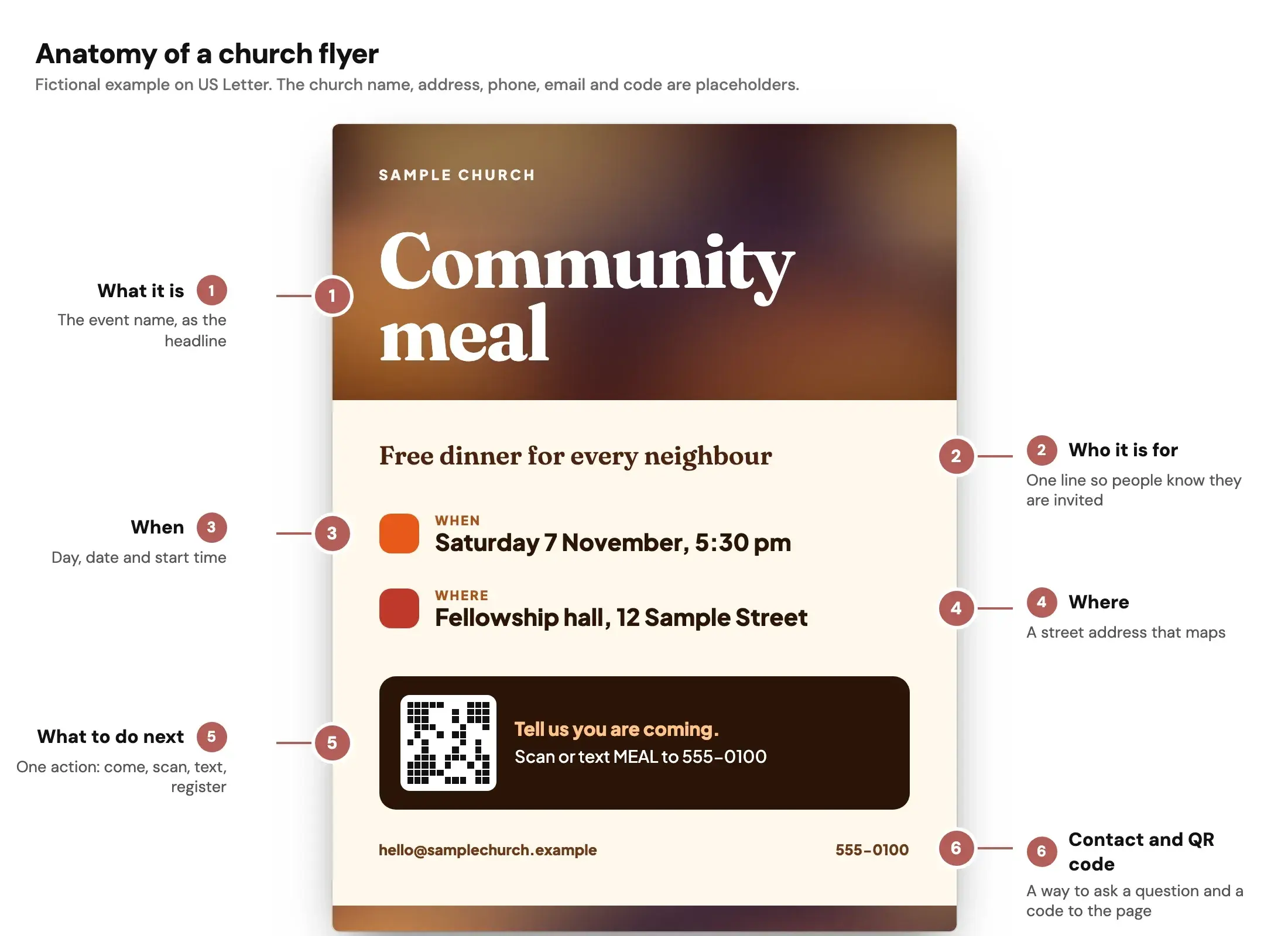
Fictional example. The church name, address, phone number and email are placeholders.
Printers and design teachers give much the same advice: GotPrint suggests one idea per flyer with the date, time, address and one call to action, and Reachright Studios says a flyer is not a brochure, so push the details to a web page. Both pages were read on 15 October 2026.
The six-item checklist
| # | Item | What to write | Common miss |
|---|---|---|---|
| 1 | What it is | The event name in plain words | A clever title that hides the event |
| 2 | Who it is for | One line: families, new neighbours, teens, everyone | Leaving people guessing whether they are invited |
| 3 | When | Day, date and start time. End time if it matters | Date with no weekday, or no year on an annual event |
| 4 | Where | Room or building and a street address that maps | A building name only the congregation knows |
| 5 | What to do next | One action: come, scan, text, register | Three competing actions |
| 6 | Contact and QR code | A name, phone or email, and a code to the page | A QR code with no human way to ask a question |
Add your church name and logo once, small. People need to know who is inviting them, but the event is the headline.
What is the standard size for a church flyer?
There is no single standard, but 8.5 × 11 inches (US Letter) is the most common. GotPrint calls it the most popular size, with 5.5 × 8.5 inches as a mid-size option and 4 × 6 inches for handouts (accessed 15 October 2026). Outside North America, A4 and A5 play the same roles.
In Design by Church Media Kit, you pick from these sizes. Print pages are stored at 150 units per inch, so a PNG exported at its default 2x scale, or a JPG set to 2x, is 300 DPI.
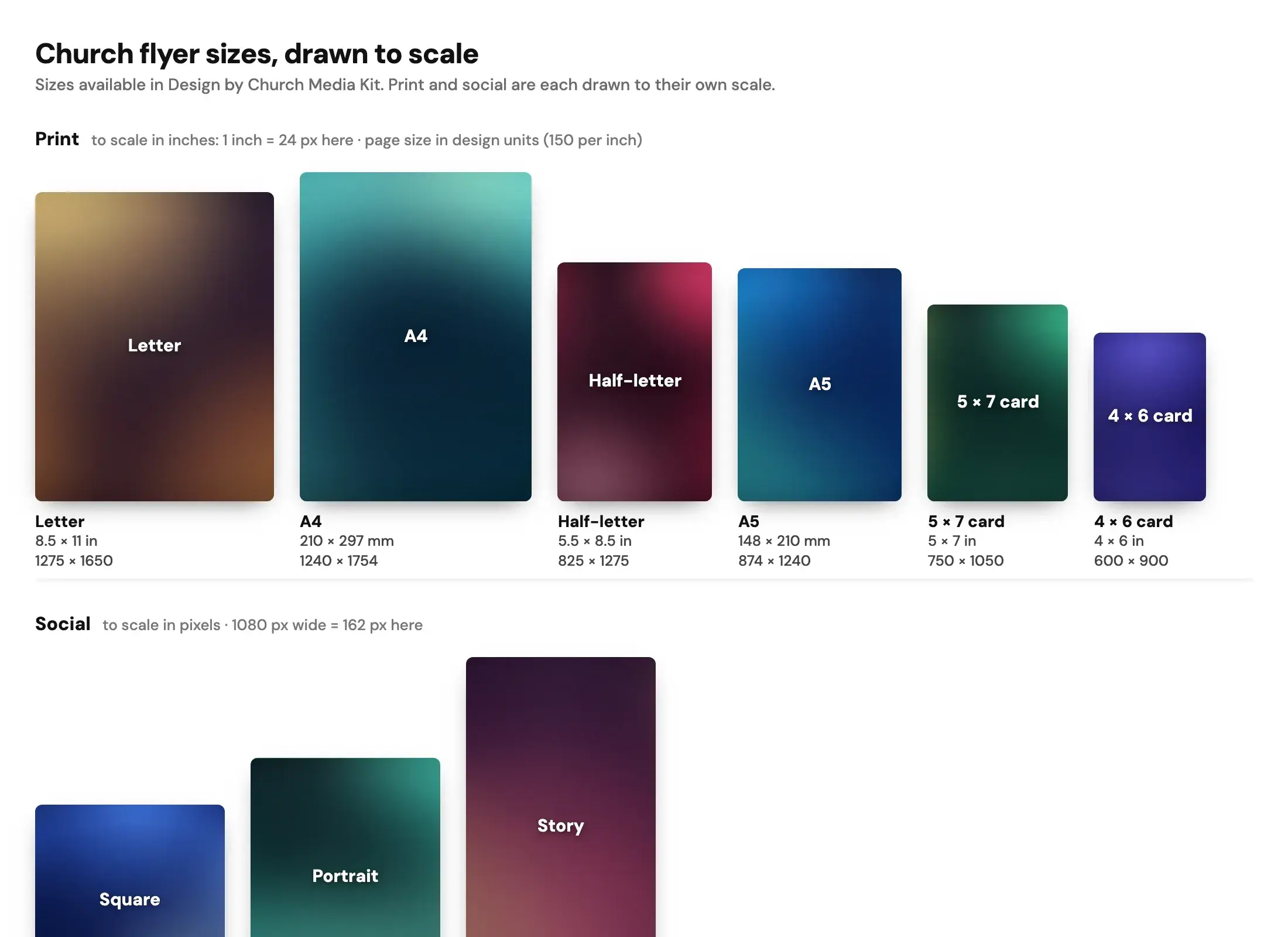
| Size | Physical size | Page size | Good for |
|---|---|---|---|
| Letter | 8.5 × 11 in | 1275 × 1650 | Wall and board flyers |
| Half-letter | 5.5 × 8.5 in | 825 × 1275 | Handouts, bulletin inserts |
| A4 | 210 × 297 mm | 1240 × 1754 | Wall flyers outside North America |
| A5 | 148 × 210 mm | 874 × 1240 | Handouts outside North America |
| 4 × 6 card | 4 × 6 in | 600 × 900 | Invite cards, welcome cards |
| 5 × 7 card | 5 × 7 in | 750 × 1050 | Larger invite cards |
| Square | 1:1 | 1080 × 1080 | Feed post |
| Portrait | 4:5 | 1080 × 1350 | Feed post with more room |
| Story | 9:16 | 1080 × 1920 | Full-height story graphic |
If you design the flyer first, you can make a copy in another size with Resize. Your original stays as it is. Check each copy, because text and crops often need a nudge when the shape changes.
Bleed and margins in plain words
Bleed is background colour or art that runs past the cut line so no white sliver shows after trimming. The University of Minnesota's printing services page says elements that bleed must extend 0.125 inch beyond the trimmed edge (page current as of 30 October 2024, accessed 15 October 2026). The print shop 4over4 asks for 0.125 inch bleed on all sides and text 0.125 inch inside the trim, with an 8.5 × 11 flyer becoming 8.75 × 11.25 inches in the file (accessed 15 October 2026).
Two practical rules follow:
- Run any full-colour background past the edge.
- Keep words and logos well inside the edge. A quarter inch is a comfortable habit.
The editor's print view can show a bleed area and a safe area on print-size pages. Print shops differ, so check your printer's own template before you order. If you only print at an office copier, skip bleed and keep a generous margin, since most office printers cannot print to the paper's edge.
Check the print sizes for your own flyer:
Flyer print size calculator
Pick a paper size to see its bleed, safe area and the pixels to export for print.
Trim size
8.5 × 11 in
Size with bleed
8.75 × 11.25 in
Pixels to export at 300 DPI (with bleed)
2625 × 3375 px
Safe-area inset
0.25 in
Aspect ratio
1 : 1.29
Trim in millimetres: 215.9 × 279.4 mm. Without bleed: 2550 × 3300 px. With bleed: 2625 × 3375 px.
In Design, keep the default 2x scale for JPG or PNG. Design stores print pages at 150 units per inch, so 2x is 300 DPI.
Worship
under the
stars
Live music, free food and a night to meet your neighbours.
Your address
Sample flyer for a fictional church
- Bleed: art runs out here, then gets cut off
- Trim line: where it is cut
- Safe area: keep text inside, 0.25 in from trim
A guide, not a printer spec. Bleed of 0.125 in and a 0.25 in safe area are the values Design uses. Printers such as 4over4 ask for text at least 0.125 in inside the trim, and some ask for 3 mm of bleed. Check your printer's own template before you order. Pixels are size in inches times DPI, rounded.
Want this tool on its own page? Open the free flyer print size calculator. For the wider picture, see our guide to church flyer templates.
What goes on a church flyer: welcoming copy by event type
Copy is where most flyers fail. These examples are original starting points. Swap in your own details and voice, and keep the six items visible.
Sunday invite Headline: Come this Sunday. Line: New here? You do not need to know anything. Just show up and we will help you find your seat.
Easter or Christmas Headline: Easter morning starts here. Line: Bring the whole family. Doors open at 9:30. Coffee is on.
Vacation Bible school Headline: Five mornings. One big week. Line: Games, songs and stories for ages 5 to 11. Register by the first of June so we have a name tag ready.
Church anniversary Headline: Seventy-five years. One thank you. Line: Share a meal and a few stories with the people who built this place. All generations welcome.
Baptism Headline: Celebrate with us. Line: Four people are being baptised on Sunday. Come cheer them on, then stay for lunch.
Community meal Headline: Free dinner. No catch. Line: Everyone in the neighbourhood is welcome. Tell us if you have food allergies.
Youth night Headline: Friday night, 7 to 9. Line: Grades 7 to 12. Pizza, music and a short talk. Bring a friend and a phone charger.
Notes on the copy:
- Use "you" and "we", not insider words. "Fellowship" and "narthex" can sound closed to a newcomer.
- Put a deadline on registration events, and say what happens after you register.
- Say the cost, even when it is free. "Free" answers a question people are shy to ask.
- Mention accessibility or childcare in a short line if you offer it.
Can you make a church flyer without pictures?
Yes, and it is often easier to read. A type-only flyer relies on size, weight, spacing and one accent colour. The sample above uses no photo at all, only type and a colour wash.
A simple recipe:
- Pick one font family and use two weights: heavy for the headline, regular for details.
- Make the event name the largest thing on the page, then the date and time.
- Use one accent colour for the date and time. Keep everything else dark on light.
- Leave empty space around groups of text. Space does the work a picture would.
- Add a thick rule to separate the "what" from the "what to do next".
- Put the QR code and contact line at the bottom, where people look last.
Add a photo later only if it is your own and it shows the real event or people with their permission. Reachright Studios argues that real church photos beat obvious stock images, which is a good reason to leave a flyer type-only when you have none.
Where can I find free church flyer design templates?
Canva, PosterMyWall and Adobe Express have flyer template libraries; read each tool's terms before you print. Church Media Kit also has church graphic templates you can edit in Design by Church Media Kit. The design editor and its downloads are free with any account. Browse the template library to see what fits your event.
What app can I use to design church flyers?
Any editor that lets you set exact sizes, use your own fonts and colours, and export a clean file will do. Choose by the job:
- Your team already uses a general design tool and likes it. Keep it.
- You want church-specific starting points, a Brand Kit for your logo, colours and fonts, and a QR code tool inside the same editor. Try Design by Church Media Kit.
- Your printer provides a template for exact bleed. Use that, and drop your design into it.
Church Media Kit does not post your flyer for you. You download the file and share or print it yourself.
QR code tips for a flyer
A QR code is useful when the next step is online: registering, giving or finding the service times.
- Link to a single page that works on a phone. Do not link to your home page and hope.
- Keep the code dark on a light background, with a clear margin around it. The common rule is a quiet zone four modules wide, but the sources reviewed for this article are vendor pages, not the ISO standard, so treat it as a rule of thumb (checked 15 October 2026).
- Print it large enough to scan from where people will stand. A code on a wall flyer needs more room than one on a handout.
- Test the printed proof with two different phones before you print the full run.
- Add a short web address or phone number next to it for anyone who will not scan.
Design's QR code tool creates a static code for any web address. It does not track scans, so use a web address you can measure yourself if you want to count visits.
Contrast and type size
Readable beats pretty. For web content, WCAG 2.2 asks for at least 4.5:1 contrast for ordinary text and 3:1 for large text (W3C Understanding contrast minimum, accessed 15 October 2026). A flyer is not a web page, so treat these as useful floors rather than a certificate. Dark text on a light plain background, a heavy headline and generous spacing get you there.
Avoid thin or decorative fonts for dates and addresses, and do not rely on colour alone to show what matters. For a deeper review process, see accessible church graphics: alt text, type and contrast.
Start with one sermon
Prepare clips and post text for your church to review.
Open Design by Church Media Kit with a free account, no card needed, to make a flyer in a print or social size. Plans start at US$29.95 a month.
A last check before you print or post
- Read the flyer aloud to someone who has never been to your church. Can they say when and where?
- Check the date against a calendar, including the weekday.
- Scan the QR code from a printed proof.
- Look at the edges for missing bleed and for text too close to the trim.
- For social, view the image at phone size. If you must zoom in, make the type larger.