Design, branding, and accessibility
Sermon series graphics checklist: every asset a series needs, and the order to make them
The eight graphics a sermon series needs, with sizes, what each one carries and a rollout order, from the title slide to the Story, thumbnail, bulletin cover, lower third and website banner.
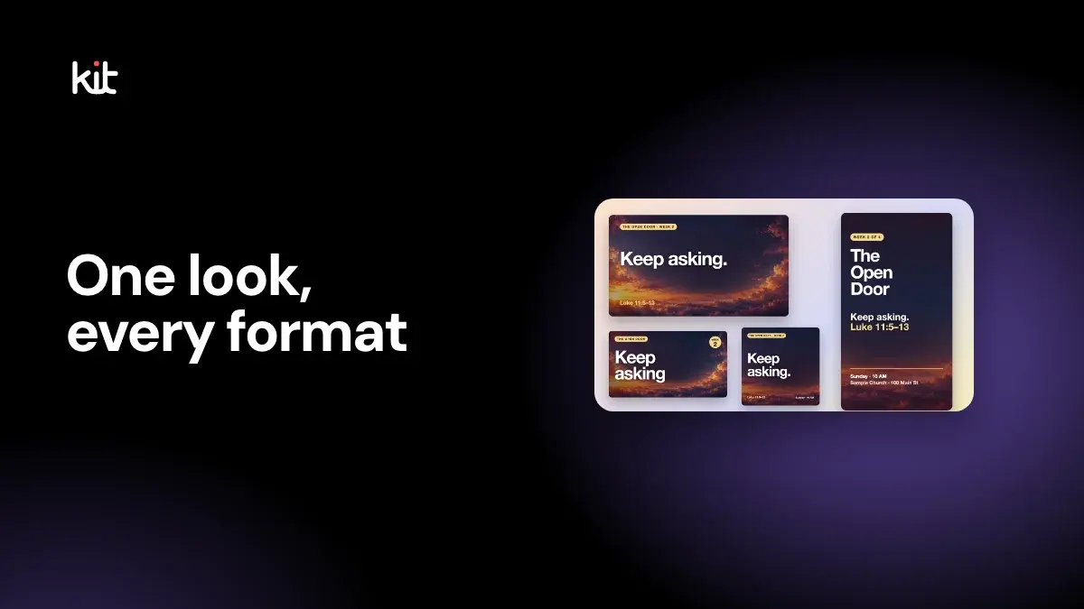
A sermon series needs about eight graphics: a title slide, a YouTube thumbnail, a square post, a portrait post, a Story, a bulletin cover, a livestream lower third and a website banner. Make the 16:9 title slide first, because every other asset is a crop or a re-layout of it. Then change only the week number, the line and the passage each week.
This guide lists each asset with its size, what it should carry and the order to make it in. It uses a fictional series, The Open Door, on Luke 11:5 to 13. Where a number is a rule of thumb or our own suggestion, it says so. It was last checked on 16 October 2026.
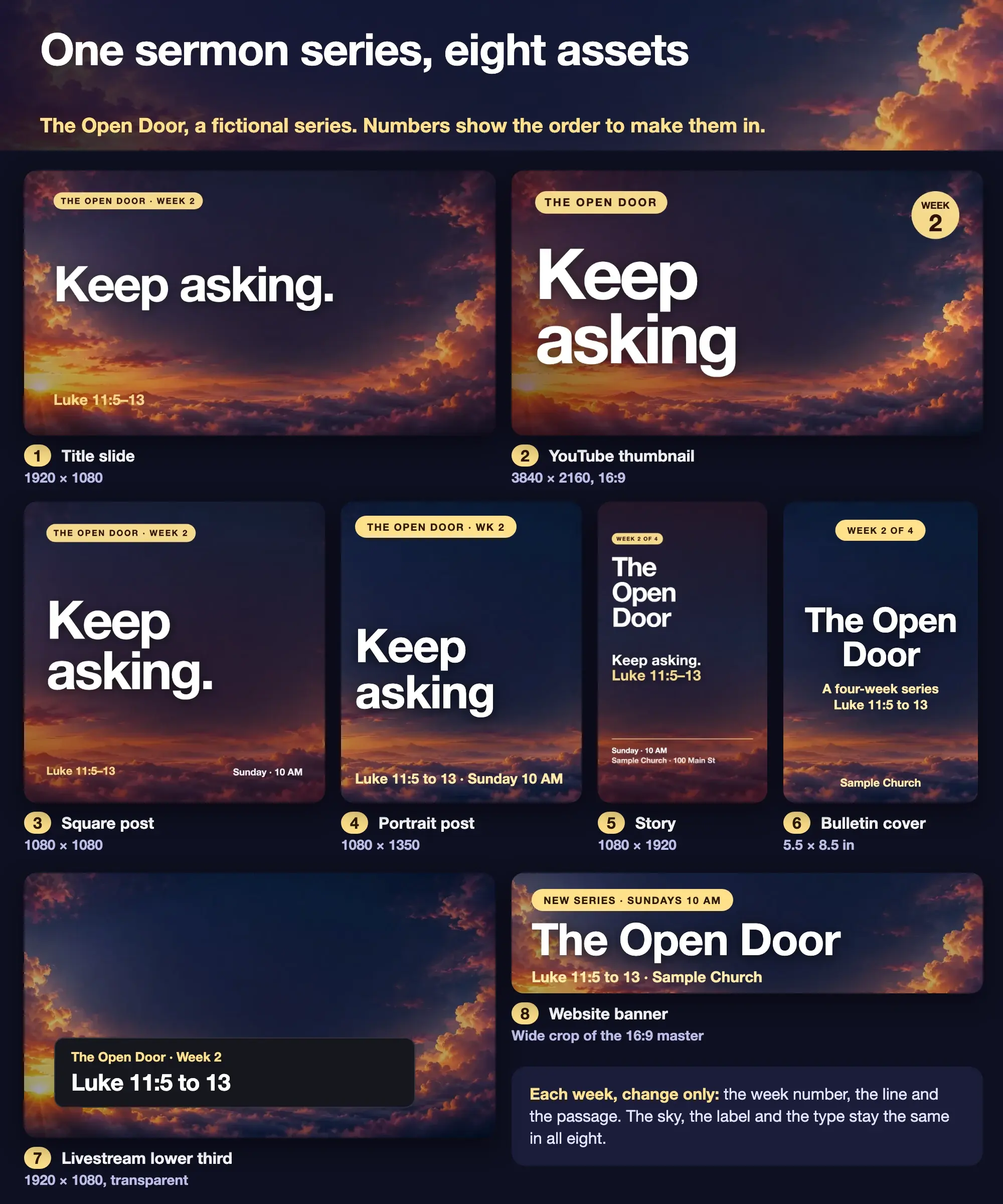
Fictional example from a sample church. The series name, times and address are placeholders.
What graphics does a sermon series need?
Start with the places people will see the series, then add one asset for each place. The list below is the one in the figure. The sizes for the three social formats and the print sizes come from the Design editor's own presets; the thumbnail size comes from YouTube Help.
| # | Asset | Size | Where it appears |
|---|---|---|---|
| 1 | Title slide | 1920 × 1080 (16:9) | The room screens, the stream's opening card, email headers |
| 2 | YouTube thumbnail | 3840 × 2160 (16:9) | The sermon video's thumbnail |
| 3 | Square post | 1080 × 1080 | Any feed |
| 4 | Portrait post | 1080 × 1350 | Instagram and Facebook feeds, taller than Square |
| 5 | Story | 1080 × 1920 | The invitation, as a full-screen vertical |
| 6 | Bulletin cover | 5.5 × 8.5 in (half-letter) | The printed bulletin, folded |
| 7 | Livestream lower third | 1920 × 1080, transparent | Over the stream picture |
| 8 | Website banner | A wide crop of the master | The top of your sermons page or home page |
Other guides give a similar set. A June 2026 guide from Ruah Creative House, on sermon series graphics, read on 16 October 2026, lists a main title slide, a blank background for lyrics, points and Scripture, a square, a 9:16 story version, a YouTube thumbnail, a motion bumper, lower thirds and a wide banner crop. It names print pieces such as a bulletin insert or invite card as optional extras. We left out the motion bumper and the blank background in the main list because they need video tools or a lyrics workflow, which not every church has. If yours does, add them: a blank background is the 16:9 master with the words removed.
What size is each sermon series graphic?
The social sizes are set by Design. Square is 1080 × 1080, Portrait is 1080 × 1350 and Story is 1080 × 1920. Church Screens templates are 16:9 at 1920 × 1080. A half-letter bulletin panel is 5.5 × 8.5 inches, and Letter is 8.5 × 11 inches. The church graphics page draws the sizes to scale.
The thumbnail needs more care. YouTube Help's page on video thumbnails, read on 16 October 2026, recommends 3840 × 2160 pixels, with a minimum width of 640 pixels and a 16:9 ratio, as a JPG or PNG. It says desktop uploads can be up to 50 MB and mobile uploads for video thumbnails are capped at 2 MB, and that your account must be verified to upload custom thumbnails. Older guides often say 1280 × 720 under 2 MB; that is the same shape at a smaller size, and it still works. For thumbnail design, see sermon YouTube thumbnail size and design.
There is no standard size for a website banner, because it depends on your site. Our suggestion is to keep the 16:9 master and crop it wide, then check the result in your site builder's own preview. Check your theme's recommended size before you export.
What order should you make the graphics in?
Start with the title slide and work outward. This order is ours, adapted from the build order in the Ruah guide, which says to lock the title treatment and build the 16:9 master before versioning every size.
- Write the series brief. One page: the series name, the passage, the weeks, the dates and the one-line promise. Decide the two fonts and one or two colours. A minimum brand guide shows how to keep that list short enough to maintain.
- Make the title slide (1). This is the master. Settle the title treatment here: the words, the case, the size and where it sits.
- Make the thumbnail (2). It is the same 16:9 shape, with bigger words. Check it at phone size before you commit.
- Make the social set (3 to 5). Square, Portrait and Story are the same design fitted to three shapes. Design can copy a finished design into another size, but check each result, because a Story has more height and needs different spacing.
- Make the print and screen assets (6 and 7). The bulletin cover and the lower third follow the master's colours. Keep text inside a margin of about 5% on every edge of the lower third, which is a broadcast-style rule of thumb.
- Make the banner (8). Crop and re-set the title so it reads at the banner's height.
- Check each one on its real surface. Put the slide on the room screen. Look at the stream on a phone. Print the bulletin cover.
The Ruah guide suggests delivering finished files at least two weeks before launch so there is room for teaser posts, and avoiding starting design in launch week. Treat that as one source's advice rather than a rule. The principle is sound: the graphics should be done before the first Sunday, so that the invitation can go out ahead of it.
How do you check a thumbnail at phone size?
Look at it small. Most viewers see a sermon thumbnail as a small rectangle in a phone feed, where fine type disappears and only the biggest words survive. A thumbnail with three or four large words, a high-contrast colour pair and no small print holds up. The tool below shows your image at the size a phone feed uses.
Thumbnail phone preview
See how a thumbnail looks at the size a phone feed shows it.

Rooted · Part 3
Hold fast
Verdict at phone size
Readable at phone size
Strong contrast and a title big enough for a 120 px wide thumbnail.
Contrast (estimate)
11.0:1
Word count
2 words
A little short. 3 to 5 words usually works best. Estimated contrast between your text colour and the average brightness of the background behind the title. At 120 px wide the title is about 13 px tall.
Finding Peace in a Loud Week
Sample church · 2 days ago
Rooted · Part 3
Hold fast
Hold fast
Your church · 2 days ago
The Table Is Ready | Easter Sunday
Sample church · 5 days ago
The Table Is Ready | Easter Sunday
Sample church · 5 days ago
Rooted · Part 3
Hold fast
Hold fast
Your church · 2 days ago
Wait Well: Advent Week 1
Sample church · 1 week ago
A rule of thumb. Contrast uses the WCAG formula, with 4.5:1 as the target and 3:1 as the floor, and is estimated from one average over the area behind the title, so a busy background can read worse than the number. Titles under about 9 px tall at 120 px wide are flagged. Channel names, videos and the feed are fictional.
Open the thumbnail phone preview on its own page.
For more on the thumbnail itself, the series graphics page shows one at 16:9 beside the other formats.
What changes each week and what stays the same?
Change three things: the week number, the one line and the passage. Everything else stays: the sky or background, the label shape, the fonts, the colours and where each item sits. That is what makes the set read as one series on a feed. The consistency guide covers the same rule for the weekly posts around the series.
Save the fonts and colours in your Brand Kit so every new design starts with them. Then a volunteer can make Week 3 by opening Week 2, swapping three things and downloading.
Which graphics can Church Media Kit help with?
Design is the browser editor where you start from a church template, change the words and photo, apply your church's logo, colours and fonts, and download PNG or JPG images or a print PDF. It covers the title slide, the social set and the bulletin cover. Sermon Slides downloads transparent lower-third PNGs for the stream. Sermon to Social drafts a week of social graphics from a public YouTube sermon. Your church posts the finished images itself. Church Media Kit does not post for you, and it does not make your website banner or upload your YouTube thumbnail. For the sizes Design offers, see how the three design sizes work.
Start with one sermon
Prepare clips and post text for your church to review.
Open Design with a free account, no card needed. Plans start at US$29.95 a month.
Before the series launches
- Is there one master slide, and are the other seven made from it?
- Do the title, week number and passage match on every asset?
- Does the invitation show a day, a time and a place?
- Does the thumbnail read at phone size?
- Is every piece of text inside the margin on its own size?
- Is there a plan for the weekly changes and a named person who owns them?
- Have you looked at each asset on its real surface: the screen, the stream, the printed page?