Design, branding, and accessibility
Sermon slide design rules: how many words, how big, how many slides
Plain numbers for sermon slides: words per slide, minimum font size for a projector, slides per sermon length, contrast, Scripture slides, safe margins and livestream lower thirds.
A sermon slide is readable when the person in the back row can read it in a few seconds without squinting. In practice that means about 20 words or fewer, type of at least 48 px on a 1920 x 1080 slide (our rule of thumb, explained below), light text on a dark background, and one idea per slide.
Most guides stop at "keep it simple". This one gives numbers, shows where each number comes from, and says which ones are our own rules of thumb. Facts that change were last checked 15 October 2026.
How many words should a sermon slide have?
Aim for about 20 words or fewer, and one idea. Logos advises keeping slide text to 140 characters or less, readable in about 10 seconds. If it runs longer, it says to shorten it or split it across slides. At typical English word lengths, 140 characters is roughly 20 to 25 words. The same guide allows no more than four sub-points on one slide.
Two limits are easy to remember:
- One idea per slide. If you need "and also", start a new slide.
- Reveal as you speak. Do not show all three points while you are still on the first.
Slides that carry your whole manuscript compete with you. People read ahead and stop listening. Put the long version in a handout or in the sermon notes.
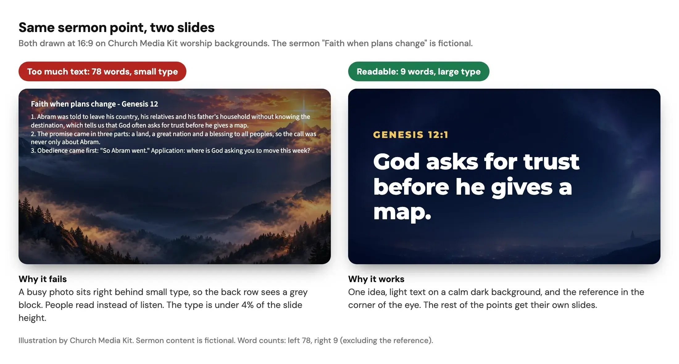
The left slide in the figure has 78 words. The right slide keeps one line, "God asks for trust before he gives a map", 9 words, plus the reference. The sermon content is fictional.
Check your own slide against the limit:
Slide word count checker
Paste the words for one slide and see whether it is short enough to read from the back row.
Too much for one slide. Shorten it or use Split for me.
Words
73
Characters
378
Lines
1
Sub-points
0

God told Abram to leave his country, his family and everything familiar, and to go to a land he had not yet seen. He did not receive a map, a timeline or a guarantee. He received a promise. Abram packed up his household, said goodbye to the only home he had known and took the first step. Faith often looks like walking before the path is clear, trusting the One who called you.
Preview on a worship background. The text shrinks to fit, so a crowded slide gets small.
Rules of thumb, not a standard. Logos advises 140 characters or less and no more than four sub-points on a slide, which is roughly 20 words. Readable is up to 20 words and 140 characters. Tight is up to 30 words or 210 characters, our own allowance. Anything longer, or more than four bullet lines, is too much.
How big should the font be on a church projector?
Use at least 48 px on a 1920 x 1080 slide for body text, and 80 px or more for the main line. The 48 px figure is our rule of thumb. It is derived from published viewing-distance rules, and the derivation is below so you can check it.
There is no single "projector font size" in points, because points depend on how large the screen is and how far the back row sits. What matters is the size of the text relative to the screen height.
Here is the reasoning:
- How far can the back row sit? The common "4/6/8" rule says the farthest viewer should be no more than four, six or eight times the image height from the screen. The rule uses 6 times for detailed reading, such as text. It was developed for older XGA projection, so treat it as a guide.
- How tall must letters be? The same page gives two rules of thumb: text height of at least 4 mm per metre of viewing distance, and, for critical text, letters of about 1/200 of the viewing distance. These are rules of thumb for good eyesight, not a standard we can quote.
- Put them together. At 6 times the image height, 1/200 of the distance is 3% of the screen height. On a 1080 px slide that is about 32 px of letter height. Letter height is smaller than font size, so we assume capital letters are about 70% of the font size. That assumption is ours. It gives about 46 px, which we round up to 48 px.
The table shows the same rule in physical sizes for three screens. The distances use 6 times the image height.
| Screen image height | Farthest back row (6x height) | Letter height at 4 mm per metre | Letter height at 1/200 of distance |
|---|---|---|---|
| 1.0 m (about 1.8 m wide) | 6 m | 24 mm | 30 mm |
| 1.5 m (about 2.7 m wide) | 9 m | 36 mm | 45 mm |
| 2.0 m (about 3.6 m wide) | 12 m | 48 mm | 60 mm |
If your back row sits farther than six screen heights away, the screen is too small for text-heavy slides. A bigger font will not fix that. It only cuts the words you can fit.
Work out the letter height for your own room:
Projection font size calculator
Enter your room depth and screen height to see the smallest text the back row can read.
Minimum text height
60 mm
Minimum font size
48 px
Calculated 46 px on a 1920 x 1080 slide, rounded up to 48 px. The 4 mm per metre rule asks for at least 48 mm.

God asks for trust before he gives a map. Abram left home without knowing where he was going.
Genesis 12:1
God asks for trust before he gives a map. Abram left home without knowing where he was going.
Genesis 12:1
A rule of thumb, not a standard. It assumes letters of 1/200 of the viewing distance and capital letters about 70% of the font size. Mock slides show text at your computed size, scaled to fit.
AVIXA publishes a standard on this, Display Image Size for 2D Content (document 202.01:2016). Its public page names the standard and says it works out image size and viewing positions from the viewer's task. It does not publish a minimum text height, so we did not use it for the numbers above. An AV integrator can run it for your actual room.
What contrast and backgrounds work behind the words?
Use light text on a dark, plain background, and check the pair rather than guessing. Logos advises light text on dark backgrounds because white is the brightest colour a projector can display. It also says to avoid red and green, orange and blue, and red and blue together. Church Motion Graphics, a worship-media vendor, recommends dark backgrounds with white text for lyrics and a clear view "from every seat in the room".
For a measurable check, the W3C's WCAG 2.2 sets 4.5:1 as the minimum contrast ratio for ordinary text and 3:1 for large text. WCAG covers web content, not projected slides, and a projector in a bright room loses contrast. We treat those ratios as a floor, not a target. In our figure, white on the dark background measures at least 11:1 and the gold reference line at least 8.5:1, checked against the brightest part of the background behind each.
Backgrounds follow three rules:
- One background for the whole sermon, as the Logos guide advises, so the slides look like one talk.
- Calm behind the words. A busy photo needs a darker overlay or a solid panel behind the text.
- Plain fonts for body text. Logos names Papyrus, Comic Sans and Times New Roman as ones to avoid and keeps script fonts for titles.
For more on testing contrast and reading size on a phone, see our accessible church graphics review.
How many slides for a 30-minute sermon?
About 6 to 10. Church Motion Graphics, a worship-media vendor, gives these counts in its guide to choosing the number of slides, published 25 March 2023. It presents them as flexible guidelines.
| Sermon length | Suggested slides |
|---|---|
| 15 minutes | 3 to 5 |
| 30 minutes | 6 to 10 |
| 45 minutes | 11 to 15 |
| 60 minutes | 16 to 20 |
This is a vendor's rule of thumb, not a study. Use it to catch a deck that is far off. A 30-minute sermon with 40 slides is probably carrying its notes. A sermon with a long Scripture reading may need more slides without being cluttered.
Estimate the slide range for your sermon length:
Sermon slide count estimator
Slide the sermon length to see how many slides a typical deck needs.
Suggested slides
6 to 10 slides
- 1
Today’s message
- 2
Scripture
- 3
Point 1
- 4
Point 2
- 5
Point 3
- 6
Point 4
- 7 (optional)
Point 5
- 8 (optional)
Point 6
- 9 (optional)
Point 7
- 10 (optional)
Next steps
A published church-media rule of thumb, not a study. Faded slides are the optional upper end of the range. A long Scripture reading can need more slides without being cluttered.
Want these tools on their own page? Open the free slide word count checker, projection font size calculator and sermon slide count estimator. For the wider picture, see our guide to church slides.
How should I format Scripture slides?
Put the verse text and the reference on the slide, and split long passages across slides instead of shrinking the type. Every Scripture slide should show the reference, so a latecomer knows where you are. In Sermon Slides by Church Media Kit, long passages continue over several slides and each one carries its reference and translation.
Translation rights are the part people skip. Most publishers allow limited quotation without asking, but the terms differ. For the ESV, Crossway's permissions page allows up to 500 verses without a formal licence. The verses must not make up more than half of any one book of the Bible or 25% or more of the total text of the work. For church bulletins, orders of service, posters, transparencies or similar non-saleable media, it asks for the initials (ESV) at the end of the quotation rather than a full notice. It does not name projected slides, so ask Crossway if you are unsure. Last checked 15 October 2026.
Other translations have their own terms. Check the publisher's page for the translation you use. Sermon Slides fills in the World English Bible by default, or the King James Version, when you give only a reference. For any other translation you paste the text yourself, and it keeps the translation name you give it. That tells you what the tool does. It does not tell you what your translation's publisher allows.
What size and margins should a slide have?
Use 16:9 at 1920 x 1080 and keep important text inside a 5% margin on every edge. That is 96 px at the sides and 54 px at the top and bottom. The margin comes from broadcast practice. EBU recommendation R 95 defines broadcast safe areas; summaries of it give a 5% graphics margin on each edge. We did not read the full document.
A projector may crop nothing at all. The margin still helps: screens, frames and livestream player controls can sit over the edges, and text that touches the edge looks cramped.
What is a lower third, and where does it go?
A lower third is the name or reference strip in the bottom part of the picture on a livestream. For slides, it is often the Scripture reference or the speaker's name over the video, with the main slide on the room screen.
Build it on a transparent 1920 x 1080 image so it lines up with the video frame. Sit it inside the safe area, with its bottom edge on the 54 px margin. In the figure, the lower third is about 1040 x 216 px with its left edge on the 96 px margin. That size is our layout suggestion, not a platform rule.
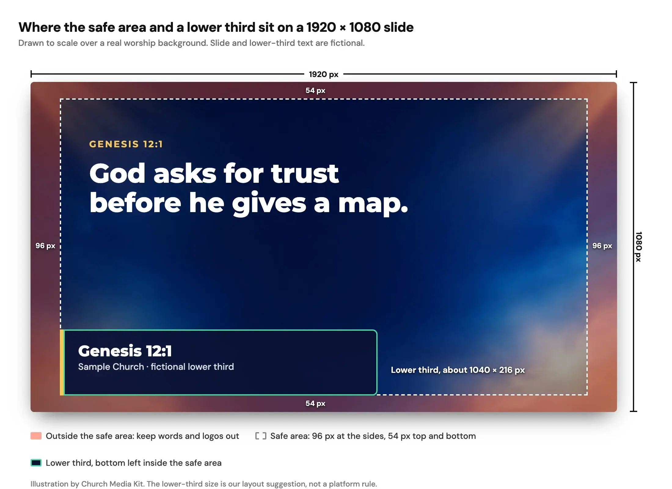
The diagram marks the 1920 px width and 1080 px height, the 96 px side margins, the 54 px top and bottom margins and the lower-third position. Streaming software commonly takes a transparent PNG as an image layer, but the steps differ, so check the guide for the software you use.
What do I do when the pastor's notes arrive late?
Keep a short routine, so the last-minute version still follows the rules above:
- Take the outline, not the manuscript. Ask for the points and the Scripture references.
- Cut to one idea per slide. Count the words. If a slide is over about 20, split it.
- Set the type size once. Use the same body and headline sizes on every slide.
- Check the Scripture text and the reference against the translation you are licensed to use.
- Look from the back row. Stand at the farthest seat, or view the slide at 25% size on your screen. If you cannot read it, enlarge it.
- Send the deck and a PDF copy to the volunteer on the projector, and confirm the lower thirds are in the right folder for the stream.
Sermon Slides by Church Media Kit covers steps 1 to 3. You paste an outline or manuscript, review the proposed slide outline, edit in Studio, and download a PowerPoint or PDF file, plus transparent lower-third PNGs. Each slide shows your own sentences, and the AI only proposes where they break into slides. ProPresenter, Keynote and Google Slides: coming soon. Check how your presentation software imports PowerPoint or PDF before Sunday.
Start with one sermon
Prepare clips and post text for your church to review.
Create a free account, no card needed, and make one deck for free. Editing, presenting and downloading that deck stay free. To make more decks, the Church Owner chooses a plan.
The rules in this guide work in any tool. Use them first, then choose the tool. If your slides are one part of a bigger weekly routine, our guide to handing a sermon from pastor to volunteer covers who owns what. Our minimum brand guide helps you fix the colours and fonts once, so the deck looks the same every week.
For the product, see Sermon Slides.